For the month of March, art teacher Catherine Smutny assigned her students to create logos for a Tracy High class or club. They had two weeks to complete the project and applied their newfound knowledge of positive and negative space to make a simplistic, yet definable logo.
“I elicited the participation of teachers and staff interested in having a logo designed for their class or clubs they advise for,” explained Smutny. “This gave students real clients to work for, as I also asked if any clients were able to come to the classes to have the students ‘pitch’ their designs to them, just like they do in the professional world.”
Willing faculty participants were given a survey created by Smutny that asked questions referring to what specifics they would like in their logo, which was then shared with the students. Once students became familiar with the concept of positive and negative space, they had to choose a client to work for and create a logo that clearly represented the class or club, but in a very simplistic way.
“Utilizing both the positive and negative spaces so that they are interchangeable is difficult,” noted Smutny. “Only the more visually advanced students were able to achieve that and some students struggled with keeping it simple.”
Smutny also instructed her students to create four versions of their design with different features so the client would have more options to choose from.
Senior Jonathan Lopez chose to design a logo for Tracy High’s entire English department. Despite his love for art, he found practicing art with technology was more difficult.
“It’s harder than drawing with a pencil,” said Lopez. “With a pencil, I can easily get my lines to curve the way I want them to, but with the program you have to manually change and move it, which gets pretty frustrating at times.”
Despite his struggles, Lopez ended the project satisfied, pleased with his logo’s simplicity.
“It was a pretty simple design and I’m happy with my end result because the way I envisioned it in my head looked exactly like it did on the screen,” he noted happily.
Mahrosh Abbasi, a Junior at Tracy High also designed a logo for English, but her design was centered specifically on Curtis Campbell’s IB English Class.
“When you think of English, it’s pretty easy to think of a few symbols that relate to the department,” Abbasi noted. “But the requirements for me were pretty limited because Campbell requested blue and green colors, and he did not want any images.”
Abbasi appreciated the fact that Smutny gave her students time to practice with the new technology.
“There’s a lot of tools, like Adobe Illustrator, that take a lot of practice, but we have practice files that we do before doing the actual project,” explained Abbasi. “That way, we have time to become familiar with the tools.”
“It may not sound complicated,” Abbasi continued. “But it was a newer concept and with positive and negative space, it can be hard to give the intentioned allusion.”
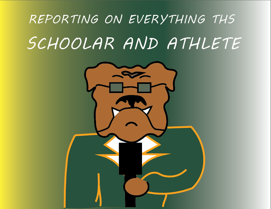
Other Graphic Art students also made designs for clubs such as the Stock Market Club and Mock Trial Club, as well as the Culinary Arts and Biotech classes. Some even did the school paper, Scholar & Athlete!